In 2020 I decided to finally create my own personal blog. Until then, I preferred to write about things in a timeless manner. A blog is by definition about points in time rather than timeless entities in a topic-space. I had also written about things on Facebook I wanted to make visible and keep for the future. My 1999 homepage had the articles grouped by category with minimal site navigation chrome. I think I used SSI (NCSA server-side includes) at one point, but that is something that makes it harder to move the homepage to new servers.
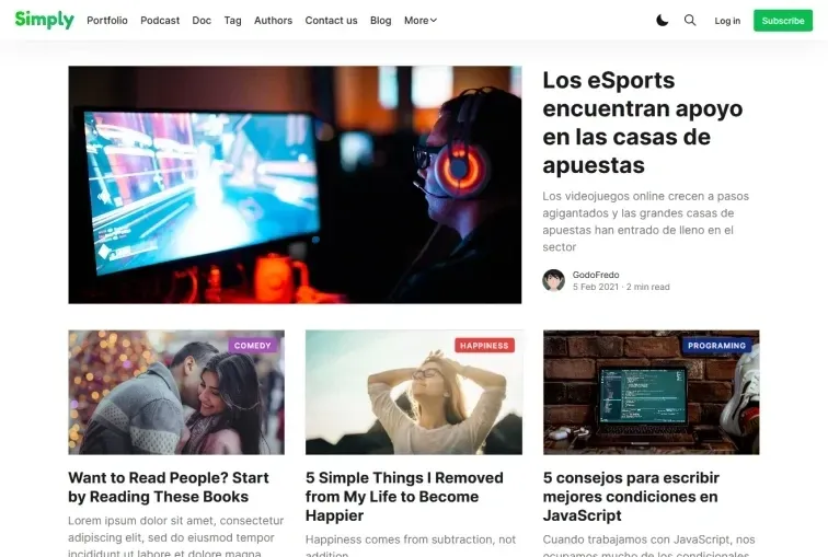
The default option would have been to start up yet another Wordpress site. I have created lots of those, using web servers under my own control, with my own mysql servers, along with lots of custom created themes in PHP along with custom and modified plugins. But since I’m now deeply immersed in the bleeding edge of javascript and web technology with NodeJS in the back and Custom Elements in the front, I wanted something I could later modify and customize. Thus, I was looking for the first best JS-based blog and CMS that would be easy to use. Checked out Ghost CMS and it looked good enough. The default was good enough. Just had to select the theme I liked and install it through the Ghost admin web frontend.
Upgrading Ghost
Three years later, I decided to update more of my 1999 website with updated contact information, CV and more. The Ghost CMS had gone from version 3 to version 5 with incompatible changes. The new version of Simply had changed a lot of stuff that I liked in the original, and other stuff was simply broken. That is the cost that usually comes with spending a lot of time perfecting a site, just to have it break after an upgrade. As a result, the current Simply theme is not as clean as the original version. On top of that, there were things I wanted that weren't included in the theme, leading me to fork the theme so that I could adapt it to my own needs. In the process I had to learn more about the ghost backend, the basics of handlebars and tailwind css.
Tailwind
Tailwind has become very popular since its creation in 2017. I don’t like all the repeated classes all over the HTML. It breaks the separation between information and presentation. I'd much prefer Bootstrap that also has the utility classes, but those are more often only used in special cases where it's the only thing having that specific style rule. That makes Bootstrap the semantic alternative to Tailwind.
CSS has seen a ton of improvements during recent years. For new projects, I would probably opt to choose something more similar to Open Props that uses css variables and color calculations without a need for pre-processing.
Tags cloud menu
I added back the Tags Cloud Menu that I got used to from version 3, that displayed the top 6 topics from the blog.
{{#get "tags"
  limit="6"
  include="count.posts"
  order="count.posts desc"
  as |category_nav|
}}
  {{#if category_nav}}
    <ul class="nav">
      <li>{{#link href="/" }}{{t "All"}}{{/link}}</li>
      {{#foreach category_nav}}
        <li>{{#link href=(url) }}{{name}}{{/link}}</li>
      {{/foreach}}
    </ul>
  {{/if}}
{{/get}}
Social accounts
Ghost CMS only supports connections for facebook and twitter. That’s partly needed in order to provide metadata for sharing articles. But since the Simply theme used those also for social media links in the footer, I needed to find a way to add more accounts. I soon found out that Ghost has a hard cap on the number of custom settings (15) and provided no other way to add handlebar variables. The only other ways provided is to add javascript code injection for every page, hardcoding the variables in the theme, or fork Ghost. This sucks. It would be nice if others could just install my theme and use it. But for now, the social media connections are all done as handlebar templates. I created partials/widget/social-item.hbs and used it in partials/widget/social-media.hbs in the menu and footer.
{{> "widget/social-item"
  social="Github"
  user="aigan"
  social_url="https://github.com/aigan"
  icon="github"
}}
SVG icons
Next up was to add icons for all the missing socials I wanted to link. The Simply theme had the SVGs created by an external tool. In order to include all the icons I wanted, I replaced the static files with a gulpfile job that would gather all svg files in src/img/icon and save them in partials/icons/svgdefs.hbs. That way I could both style them with CSS or use them as images. Had to hand-edit a lot of the icons in order to normalize the size and proportions. Having the svg symbol definitions in each page is not ideal. I would rather use custom elements (without shadow-dom) so that more icons can be added without loading them on pages that don't use them. But for this I just modified the existing theme, keeping with what's already done for style and layout.
function svgdefs(done) {
  pump([
    src(`src/img/icon/*.svg`),
    svgSymbols({
      templates: [`default-svg`],
      slug: name => name.replace(/^/, "icon-"),
    }),
    rename('svgdefs.hbs'),
    dest(`partials/icons`),
  ], handleError(done))
}
Secret backdoor
I also added a secret backdoor at the bottom right corner of the page. This is an homage to the 1995 movie with Sandra Bullock, which has been a part of many of my websites since I started building web applications during that same year. The icon is supposed to be flaming, but I’m still waiting on that CSS property. The link goes to the editor so that I can update the corresponding page or post.
<div id="pi-pos">
  <div class="flame"></div>
  <a href="/ghost/
    {{~#is "post"}}#/editor/post/{{post.id}}{{/is~}}
    {{~#is "page"}}#/editor/page/{{page.id}}{{/is~}}
    ">π</a>
</div>
Social sharing links
I decided to remove all the Share this article noise. Desktop users know how to copy URLs. Mobile users have their own systems for sharing. And those systems will soon also come to the desktop. Keep the page clean but make it simple for everyone to add their own stuff.
Accessibility is much more than supporting screen readers. For me, it’s about
- Only move things in response to user actions. This includes pop ups, animations or anything else that grabs attention.
- Use semantic markup so that your tools can process the page for you, such as printing or reading the article.
- Don't block things like selecting text or downloading images.
Dark mode
Did some adjustments in order to get a transition for switching between light and dark themes. That thing is basically a toy. It's fun to see it pulse between dark and light. It will react to the prefers-color-scheme css media feature, which often syncs to the device preferences. The implementation in the theme is a bit messy. All the listeners should have been put in an external script and loaded after first render. But it works ok and uses localStorage and matchMedia.
body, body>div>footer, body>div>header, .post-related {
  transition: background-color 1.5s ease;
}
Added a frosted glass look to the header by combining transparency and blur.
header {
  transition: transform .3s, background-color .7s ease;
  backdrop-filter: blur(10px);
  background-color: var(--header-bg);
}
Scrollbar
The scrollbar situation is a mess. The browser default is to only show the scrollbar when needed, but that will result in changes in the page width. My solution has usually been to always add the vertical scrollbar, so that centered items don't move when scrollbar appears, or on jumping to another page with or without the scrollbar. For this site, I opted to use scrollbar-gutter, available since the middle of 2022. But it should not be used on pages specifically designed to not scroll. For this site, it solves the layout shift that would happen when clicking on the search icon.
html:not(:has(>body.overflow-hidden)){
  scrollbar-gutter: stable;
}
Discussion links
I wanted a more consistent formatting of the discussion links. Those are links to the posted article on social network sites. I may have posted the article to more than one, like reddit, facebook and twitter. The Ghost CMS provides no way to add the data to the post settings, other than using tags or code injection. Frankly, this is why Wordpress dominates the CMS market. They provide hooks for every part of the GUI and ontology. Some other frameworks allow for custom data in frontmatter. Missing that, I ended up constructing a post-processing of the article, that would extract additional data from the last paragraph. It basically scans the paragraph for [[...]] and adds the links to the list of discussion pages.
const re = /\[\[\s*(.*?)\s*\]\]/g;
for (const match of txt.matchAll(re)) {
  const link = place(match[1]);
  if (!link) continue;
  links.push(link);
}
The Simply theme has a basic layout that allows for content in the article to have normal width, extra width or full width, by using a grid layout. A common case would be to have some images use the extra or full width. I wanted to have some images float to the side with text wrapping around, but use the available margin. This is the Simply theme grid layout for articles, using tailwind compiler:
.godo-canvas {
  display: grid;
  grid-template-columns:
    [full-start] minmax(4vmin,auto)
    [wide-start] minmax(auto,240px)
    [main-start] min(680px,calc(100% - 8vw))
    [main-end] minmax(auto,240px)
    [wide-end] minmax(4vmin,auto)
    [full-end];

  & > * {
    grid-column: main-start/main-end;
  }
}
Using that, I wanted to have a special template with floating image, if there was enough width for it. This is used in my about and techstack page.
figure.aigan-float > img {
  height: max(45vh,10em);
  object-fit: cover;
  object-position: center 33%;
  width: 100%;
  border-radius: 3px
}

/* transpiled by tailwind as media query */
@screen lg {
  figure.aigan-float {
    width: 20em;

    /* move right based on .godo-canvas */
    margin-right: calc(-46vw + 340px);
    margin-left: .5em;
    float: right;
  }

  figure.aigan-float > img {
    height: 100%;
  }
}
And more
There were a lot of other bug fixes and layout changes done. You can look at the result on this site or the code in github.
Ghost replacement
After all this, I would rather have a more flexible system, using more of the modern web. Something like 11ty or Astro. That would allow me to add more stuff without stupid workarounds. Especially with the markdown frontmatter. That would also let me save all the pages with git. Ghost seems more business oriented. I'm more of a idealist.
[[https://twitter.com/aigan/status/1681626691783852032]]
[[https://www.facebook.com/aigan/posts/10159479835207393]]