
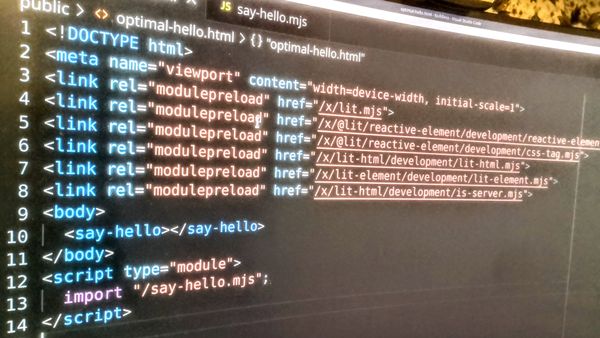
The goal is to have something that can be integrated in any framework of styling and DOM manipulation, while keeping it simple with few abstractions. I’m using existing and upcoming technologies of the web platform to keep things readable, easy to change and extend. The combination of several async flows together with animations and differing browser capabilities makes this non-trivial. Rather than abandoning things that didn’t work out, I kept at it to find the most elegant solution. You can see the result here and on wiki.para.se and check out the code directly in the browser DevTools and on aigan/jl-search.
See my article about modern web development for why bundling is no longer needed. Features used include ES 2022 syntax (2021), cascading css variables (2020), color mixing with oklch (2023-05), mobile keyboard handling with beforeinput (2021), custom elements with optional shadowdom (2020). I’m also using the popover api (2024-05), anchor positioning api (TBA), view transitions api (TBA), the navigation api (TBA) and more. For compatibility with older browsers, these are handled with polyfills or graceful degradation. Dates are for when it was added to all three major engines. Mozilla is often the last and has trouble keeping up. The anchor positioning api is not finalized and is only available behind a flag in Chromium.
Wikipedia database
In order to have a good demonstration of something to search for, I downloaded some of the wikipedia SQL database dumps. No point in having a client-server search widget if all of the options can be downloaded before the user starts typing. The tables were adjusted for quick prefix search results, which took a lot of work. The default table was actually not stored as unicode, but binary. So I converted them to utf8mb4 and indexed them with Swedish collation. Even that was not quite quick enough for retrieving the total number of search results for the first letter, so I added an additional table for the most common prefixes. The complete source code along with notes of the changes made to the tables can be seen in searches.mjs on github. The total number of search results along with retrieval time is displayed at the bottom of the options list in the demo.
INSERT IGNORE INTO prefix_counts (prefix, row_count)
SELECT DISTINCT
    UPPER(LEFT(title_se, 2) COLLATE utf8mb4_swedish_ci ) AS prefix,
    COUNT(*) AS row_count
FROM page
GROUP BY UPPER(LEFT(title_se, 2) COLLATE utf8mb4_swedish_ci );
The Wikipedia dumps are quite large so I created a dedicated Xen virtual debian server for the database to limit the impact on other servers. After all the work of transforming and indexing, the actual use of the table doesn't require much memory or CPU. This dump is from January 1st 2024.
Async results
I could have downloaded even more of wikipedia in order to also return the images and description, but the official wikipedia api turned out to be fast enough to fill out the details of the search results, and it also gave the opportunity to showcase async processes where parts of the search result is filled in when the additional information is finished loading, at the same time as new search results are coming in while the user is typing. I also gave the option to animate the options row, meaning that several rows may be animating out while new rows are added. And all this while taking care of jitter in the search responses.
It’s often the case that a backend server handling the incremental search will return results out of order. Searching for s will be slower than searching for spock. I added a Slow down option to increase this effect. The demo has an option to simulate slower server response, that will on purpose send back results in the wrong order just to make sure that it will not mess up the presentation.
The on_result() handles the jitter by checking if (res.req < $el._data.received.req). But the same goes for the whole process. Retrieved data will be prepared and then rendered. Here I’m assuming that searching and preparing is async while the rendering is done sync, based on the latest prepared data. Thus, the state exists in three versions as received, prepared and rendered. I will not cancel or ignore results from older queries since they will come in useful if the user backspace characters. If necessary, the req_id could be sent to the server that could use it to cancel ongoing searches if a later req_id comes in from the same client.
Autocomplete
How do I implement inline suggestion? With autocomplete, I’m referring to how the first search result is inserted in the input field, but selected so that you can continue to type and ignore the suggested completion. You may accept the suggestion by using the right arrow, jumping to the end of the text and de-selecting the text, or by pressing enter, which will submit the search with the suggested text. You can also step between the entries in the dropdown by using the up or down arrow keys. Using the backspace key will first remove the suggestion and after that delete characters as usual. You may also use the esc key to back out of the search field. First esc closes the options list, second selects all the text and the third will revert/remove the text.
Have you noticed how the google.com search field no longer uses autocomplete? The Chrome new tab Google search field and the URL field have the capability, but not the actual webpage version. This type of autocomplete is not compatible with how mobile virtual keyboards function. The virtual keyboard will update the input field through autocorrects by selecting text to be replaced and then replace it with the new string.
If you for example try to type bold but the keyboard autocorrects it to books, you can tap the correct word on the keyboard. The phone will first get the current value of the field, and then send a selection event selecting ld, followed by an insertReplacementText event with oks. Since these events are async, it is very possible that you may have changed either the selection, the text or both in the field in between the virtual keyboard doing its own selection and replacement. This also works differently on desktop, phone and differs between the different browser vendors and versions. Chrome has for example completely stopped sending letter information in keydown events. In order to make this type of autocomplete work you would have to completely take over the update of the field, by parsing the beforeinput events. On top of that, It’s really not a good option to try to detect if a phone is used. There are other types of virtual keyboards that could possibly be used with the desktop browser version. As far as I know, there is no right way to know if the keyboard is going to send auto-of-sync events. Even so, I did some things to make the autocomplete work pretty good. And I have more things I can do to make it 100% solid if needed.
Flexible style
The style for the search component is placed in a separate file in order to make it easier to change or completely replace, using any other type of design system. The main demo is using the traditional light dom, making the search component part of the main style. I also have one demo that encapsulates the component in shadow and another one that uses it from inside a Lit element. The component will work both with and without shadowdom, and the demo that uses shadowdom transform the main jl-search.css while loading it, converting the jl-search selectors to :host() selectors.
  <jl-search>
    <main>
      <fieldset>
        <input placeholder="Do the search">
        <span class="state"></span>
      </fieldset>
      <nav>
        <section>
          <hr>
          <ul></ul>
          <hr>
          <footer></footer>
        </section>
      </nav>
    </main>
  </jl-search>
Since we are using semantic markup, there is less visual noise. The expected tags are:
<main>for the part of the component that will popup and may also move in the viewport as is the case for mobile devices.<fieldset>, that will serve as the input group and can hold more prefix and suffix icons. The dictionary icon was added for the demo.<input>, as the main field where the user will type.<span.state>is used for conveying the state, such as loading or error, and also used for expanding or collapsing the options list.<nav>, is the container for the search result and will be the part that expands or contracts.<section>, placed in nav is a concession for handling sizing and animation of the options list. Ideally it would not be needed.<ul>is the container for the options list.<footer>is intended for user feedback, such as instructions, validation messages, error messages and the like.
In the default style, I’m also using <hr> tags for separating the list from the input field and footer.
CSS variables
How do I make the hover color relative the existing color? For making the component theming flexible I used css variables with default fallbacks. As a naming convention I’m using underscore prefixes for the internal variables. For example, --_padding is initialized based on --padding, with a default fallback value. This makes it easy to style the component with jl-search { --padding: .75rem } but the value can still be used internally without having to provide a default everywhere it’s used. The outline can be a combination of theme, the state such as valid, invalid input, focus, disabled, hover and active.
main {
  --_outline-color: var(--_outline-base-color);
  --_outline-width: var(--_border-width);
  outline: solid var(--_outline-width) var(--_outline-color);
}

main:focus-within {
  --_outline-base-color: var(--_focus-color);
  --_outline-width: var(--_border-width-focus);
}

main:active {
  --_outline-base-color: var(--_active-color);
}

main:hover {
  --_outline-color:
    color-mix(in oklch, var(--_outline-base-color)
    var(--_hover-brightness), black);
}
Material design v3 color system and OKLCH
To showcase the dynamic theme capability, I implemented the Material Design version 3 color system, but with the OKLCH color space that supports colors way beyond the RGB, P3 and even REC.2020 color gamut. The OK variant is adjusted for the human perception such that color-mixing will match up with human expectation of color blending and lightness. But the current browser implementation in mozilla and chromium has a bug where chroma beyond the monitor capability will be mapped to the closest available color even if it’s another hue, making darker shades of yellow turn out green. I submitted a bug report along with a demo.
Here is the full color palette of my Material 3 implementation. One part of the palette involves rotating the hue for a matching complementary color. Support for doing that type of color calculation within css is limited. Chromium supports css @proprty declarations while Mozilla supports math functions like mod(). I constructed the css so that it will work on both. Safari can do it either way. I found the solution at css-tricks.
Material symbols font
The demo is using icons from the google fonts material symbols, but those are optional and the main library defaults to unicode icons. The font is currently the thing that slows down the demo most. But they also serve as an opportunity to show how external resources can be loaded async without holding up the first paint. You can slow down cpu and network in the browser devtools to see the loading slowed down. The indirection of loading a css from google fonts that in turns load the actual font not only slows things down, but also makes the promise a two step process. First load the style, waiting on the load event, and then using the document.fonts.load promise. The material symbols font is using ligatures which leads to simpler code and good accessibility fallback, but are awful if rendered before the font is ready. A user-select: none will help with the unintuitive behavior during text selection. The font is easy to work with since all the symbols have the same size.
Animations
The component is using a mix of animation techniques. On top of the css transition and keyframe animations, it also uses web animations api, view transition api and direct use of requestAnimationFrame. All of these are orchestrated with async events that may start, stop or reverse additional animations. For mobile viewports, there is a chained animation that will first finish loading the popover polyfill if needed, then activating the popover, doing a view transition to the top of the viewport, followed by animating the expansion of the options list. There are also fallbacks for the options to not use animations, so that promises don’t get stuck waiting for the next step. It would be faster to use scaleY for opening the dropdown, but that looks ugly. The current animation is possibly a bit heavy, but using contain: content helped a bit. Also take a look at the flash animation for validated selections and the shake animation for invalid selections.
ViewTransition API
The ViewTransition api allows for smooth transitions of elements both inside a SPA and between pages. It can handle fadeouts of elements removed from the dom, or movement and resizing of elements even if they are rendered as different elements in different parts of the tree. This allows for hero animations. I’m using this for the images in my blog, but that capability is still behind the #view-transition-on-navigation flag in chromium, since it’s for transition between page loads. In the <jl-search> component, I’m using it for moving the input to the top on smaller (mobile) viewports. This allows for easy movement animation even when it's the result of something that usually isn’t possible to transition. In this case, changing the position from static to fixed. You can use the chrome devtools animations tool to slow down the animation to see how it handles the transition by stretching and fading between the start and end state.
The view-transitions operate on the document root, so there needs to be some coordination while doing it. It also pauses all pointer events, which can cause problems when a click will start a transition with the default .5s duration causing the click on other parts of the viewport to fall through to the document root. This is not a problem in the demo since I only do the transition if actually needed, and also removes the default animation-duration. But for handling those more unusual situations, I record the clicks happening during the transition and play them back afterwards.
Popover API
Many new web platform APIs introduce new capabilities that do things that can’t be fully polyfilled. Without these, you would often have limitations on what can be done within a single web page. All the components have to be orchestrated together to not step on each other's toes. The popover API solves a couple of those problems where different parts of the page compete for the top position. A common solution is to put the component last in the main body and give it a high z-index. Another solution that I have previously used is to create a ensure_ontop() method that will go up the tree and give each parent a z-index higher than its siblings. That will make sure that the component still inherits all the styles. Things like Tailwind that give up on the whole idea of the cascading part of styles has probably increased in popularity because of the problems of having to move components around to handle positioning, rendering and animation. But the popover and positioning apis solves a lot of this by introducing the top layer stacking context, also used by <dialog>. Now you can use menus, dropdowns, tooltips, popups and the like without having to do extra work so make it actually appear above everything else.
Error handling
Errors can occur even in a completely bugfree application, due to variations in internet connectivity, browser plugins, memory exhaustion and other exceptions. But it’s usually good to also handle bugs gracefully. Especially in a larger application with components loading in on demand and updating independently. This component will handle errors both from search, result processing and rendering, including plain syntax errors. For a production environment, there should be a telemetry set up by listening on the global error and unhandledrejection events. But I would still show unresolved issues to the end user, making it possible for power-users to work around any issues.
You may check out an example of an error presentation by entering trigger error for a server side error or i am lying for a client side error. (Because Kirk proved thet you can make any computer explode by giving it a paradox.)
Reactive state (Signals)
The component doesn’t use reactive state. That means that functions using specific properties must be called when any of their dependencies updates. For larger projects, I would prefer to use reactive programming, where dependent functions will be repeated when any of their dependencies are updated, even if its indirect dependencies, like in a spreadsheets application.
Signals is currently in the process of becoming a javascript standard, in collaboration with authors of many of the largest frameworks. I mostly know of the design pattern as presented by MobX, but many other frameworks and libraries are using similar patterns for their state management.
I have done extensive work on multi-user client-server reactive state on semantic graphs using the Causality library (similar to MobX), and that was the base implementation that inspired this limited <jl-search> widget.
ChatGPT
ChatGPT 4 has been a useful companion while writing this component. But not for actual code. It has been all too happy to output code examples, but I don’t think it has produced a single line of usable code. Probably trained on Stack Overflow, it usually produces code for ancient browsers, excessive verbosity, hallucinated APIs and so on. But it works well as a Rubber duck for thinking through problems. It’s good for brainstorming, familiarizing myself with new things and finding gaps in my knowledge. Also good for looking up API for specific use cases and sometimes to get stubs for new functionality. I also often use if to get an overview of terms and naming conventions used in different design patterns. Just don’t believe anything it says because it will often validate your approach and totally ignore the much better option.
jl-search.mjs
[[https://www.facebook.com/aigan/posts/10159872220392393]]
[[https://www.linkedin.com/pulse/implementing-latest-web-technologies-fast-flexible-search-liljegren-00ygf]]
[[https://twitter.com/aigan/status/1772409188854989006]]